Design System Case Study: Scalability and Acessibility for a SaaS company

👩🏻‍💻 Role: Design System Designer

🗓 Duration: October to December 2023

📑The Brief

LineSlip Solutions is an award winning software company specializing in managing and organizing insurance data for its clients.
I was hired to help them create a design system library for their existing internal SaaS platform. Despite their future plans with fully converting their current platform to a new branding, they wanted to have a system in place that stores all of their visual assets and reusable components and would help streamline future development processes for their team and product.

Laying the Goals

At the start of the project, it was important to lay down the overarching goals that would help make the project a success. These were the 5 goals that were important to the business:

  1. 🏋️‍♀️ Comprehensive (supporting branding, data visualization, and colours)

  2. ✅ Consistency (colors, icons, typography, and the molecules)

  3. 🔍 Accessibility (color system provides sufficient contrast ratio and is aligned to WCAG guidelines) 

  4. ⚖️ Scalability (the components, colors, and typography can be extended with least disruption to existing and future implementations of the SaaS platform)

  5. 🏷 Tokenization (provide single source of truth and better understanding for designer/ developer on how and when to apply colour palette and spacing for the platform)

🚨 Identifying the Problems

While performing an audit if the internal platform, I identified inconsistencies to the following:

  1. The icons had inconsistent strokes and sizes

  2. There was little uniformity in colour hierarchy for texts and components. For example, some headers had different shades of black. 

  3. Buttons were inconsistent and un-unified, as they appeared in different colours and sizes across the platform.

  4. Excess use of utility colours that can be reduced  for texts and border outlines. 

  5. Improper use of colours for data visualization (ie: mixing brand colours with data) and conflict with WCAG guidelines.

  6. Unclear patterns of button choices and variations

😓 Handling challenges

While it made sense to replace or update the existing icon set with a more unified icon library, the Product Manager wanted to save time and keep what was already there. Therefore, only tweaks were made within the iconography groups to ensure that almost all icons were consistent in stroke thickness and size.

In addition, I proposed to make updates to the buttons, so that they were more unified with hierarchy statuses, but it would amass a lot of changes as all of the existing components in the current platform would need to be changed. The business didn’t want to take this direction, but would look into the possibility of redesigning it to align to their new branding in the future.

Buttons from the new branding and old branding with different states
These were all of the colors used in the current platform

🧹 Removing clutter

While a perfect scenario would be to reduce the button variations and make all of the colour swatches consistent and linear showing gradation of colours, it was not feasible to do based on the time and budget constraint. Instead, what followed as the obvious solution was to reduce the clutter of styles and components found across the entire platform. 

I collected and documented screenshots of all of the different types of tables and lists used, text styles, types of calendars, colours and many more to bring forward to the Product Manager. From there, were were able to cut down on removing things that the company didn’t need.

We were able to reduce 17 utility colours to 12 that are used for border strokes, texts, and background colours, cut down the excess calendar and tables options, and redefine and make the usages of colours consistent for button and message states. 


🧱 Putting together a design system library

Just as creating component kit is useful to the design system library, documentation is crucial too. 

Since the business did not want to change any of their existing buttons and they were different in color and size than each one, it was important to address the intention of each button and its variant and when, where, and how they are used.

Are the variants random or intentional?

Where,when, and how are they used?

What are their different functions?


🏷Turning color palette into color tokens

In addition to organizing and putting together a unified colour palette, I created colour tokens to support scalability and help define the component and use cases. This helps create clarity for the correct usage of colours, spacing, and font size choice, which the current system didn’t have. 

Also, by creating a main component and different variable states, it would speed up the design process if the platform continues to be expanded. 

Putting the SaaS application back using components

I created a master library on Figma 40 reusable components, including icons, dialog boxes, tool tips, toast notifications, inputs, pagination, checkboxes, tables, accordions, tables, and many more.

I was able to easily put together several application screens to show to the Product Manager and the developer at the end. 

Application with Administration View
Application with Client Profile View

📊 Data Visualization

The previous version of data visualization sets used the company’s brand colours to illustrate data. This can create problems for the user to mix visual data communication with the business branding. 
Therefore, it is important to help redefine another color palette that is unique to data visualizations only. 


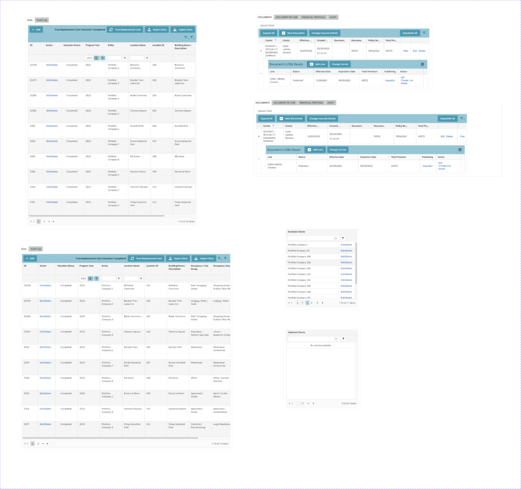
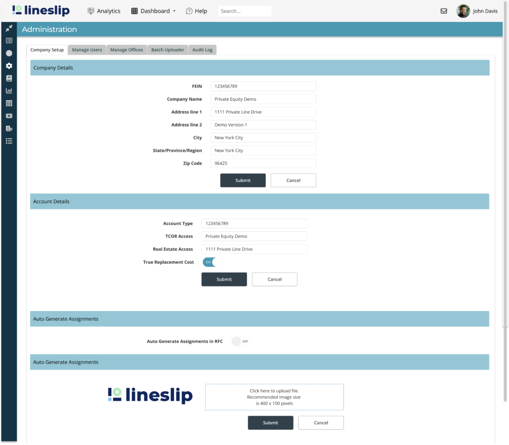
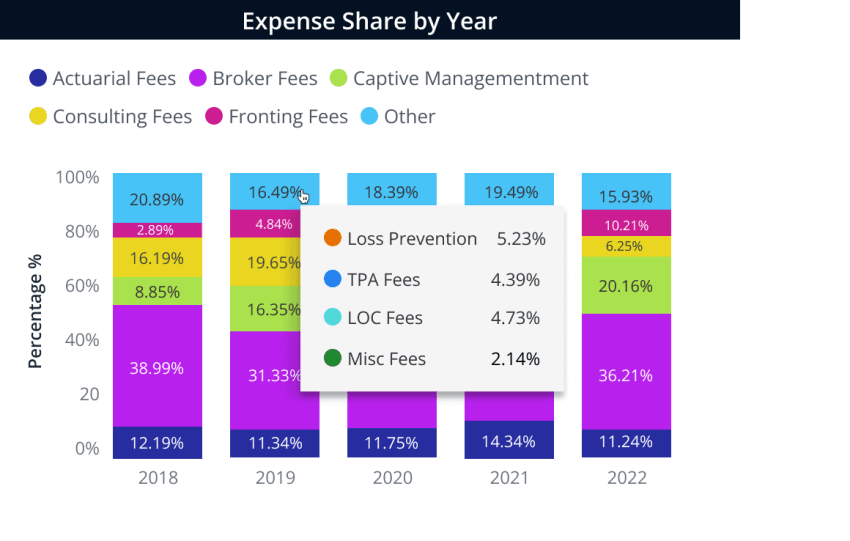
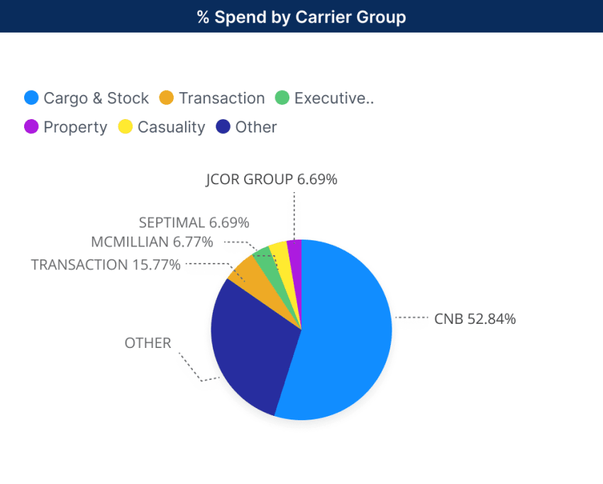
Current data visualization contains clash of brand colors 

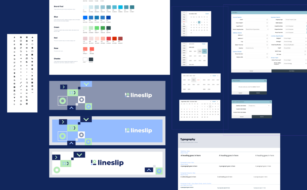
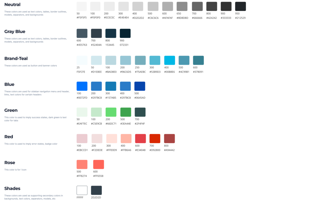
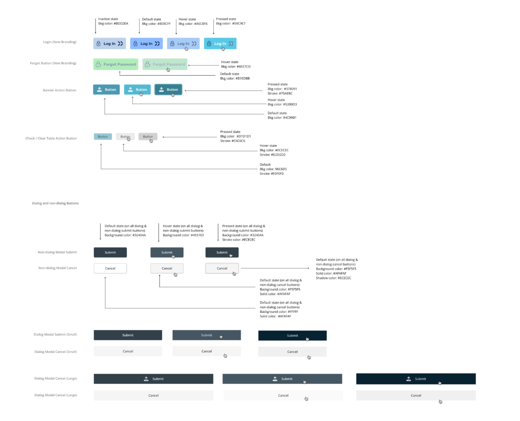
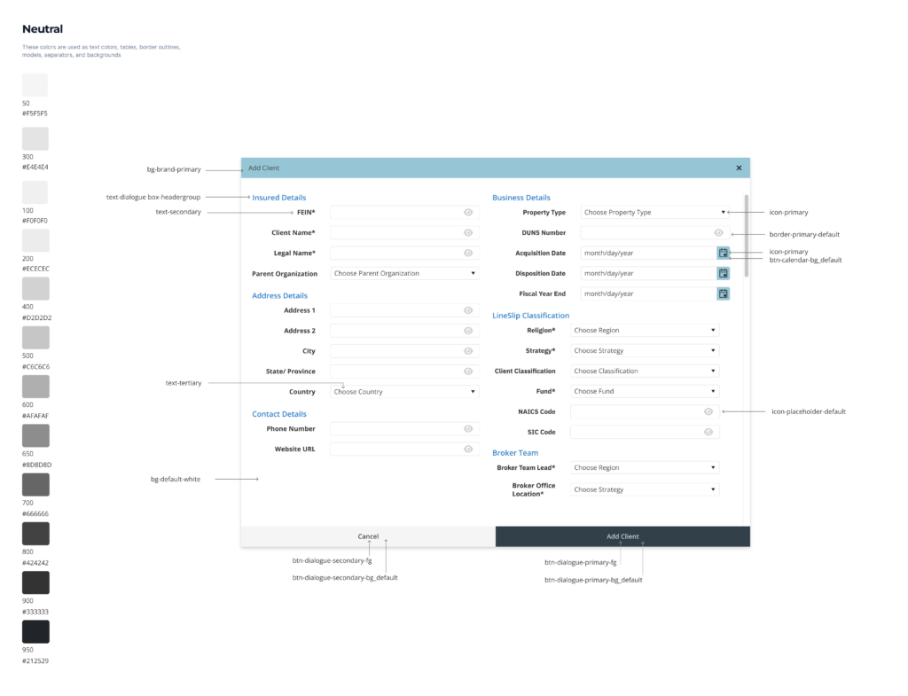
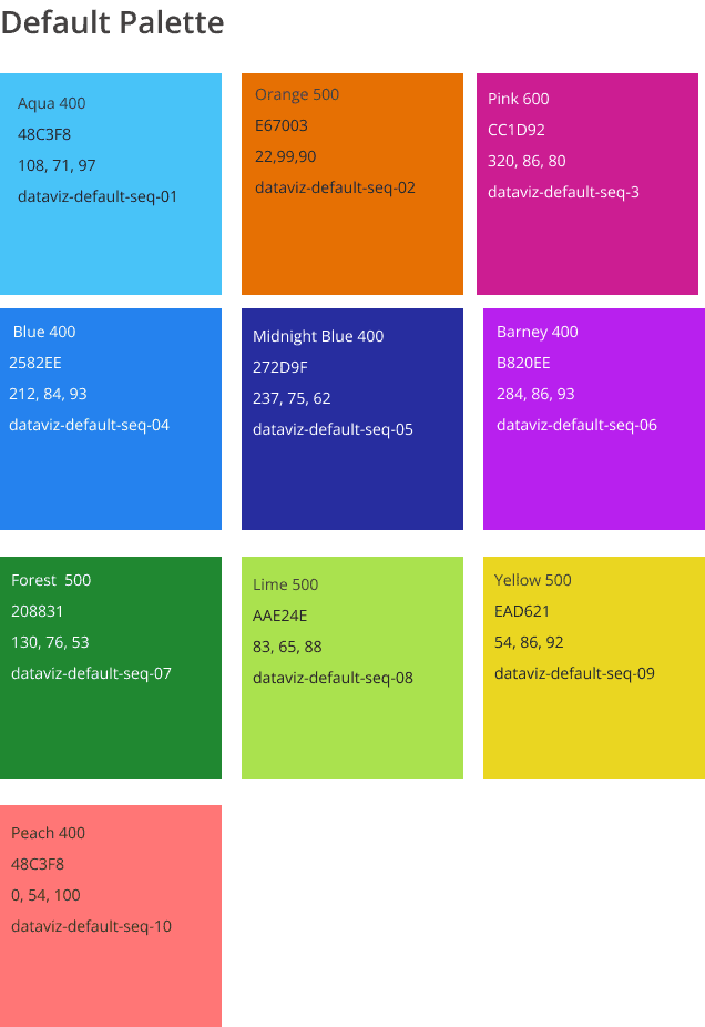
Redefining Color Palette

Researching several notable design systems in the likes of Adobe Spectrum, Goldman Sachs, Atlassian, and Carbon Design Systems, I narrowed down to the 10 data palettes that are visually equidistant and support accessibility.

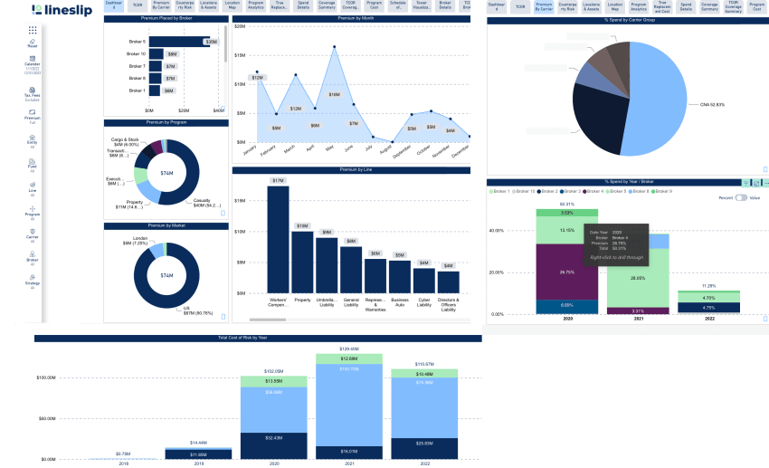
Examples of Improved Versions of Data Visualization

Reducing cognitive overload of placeholders from 10 to 6. User can hover in the “Other” category to see a popup of a detailed breakdown of the expenses. 


💡Learnings and Takeaway

Working on this design system project was a great learning experience for me. It was a big change from my previous design projects, which focused more on visual design and creativity.

This project not only gave me a big boost in working faster and more efficient on Figma, but it allowed me to think systematically and understand the importance of creating a shared design language for companies that need to be communicated effectively amongst stakeholders, developers, and future designers. 

Creating the component library and documentation is a constant work in progress that will continuously be be open to iteration to improve, adapt and scale to bring more order and uniformity to the platform.